
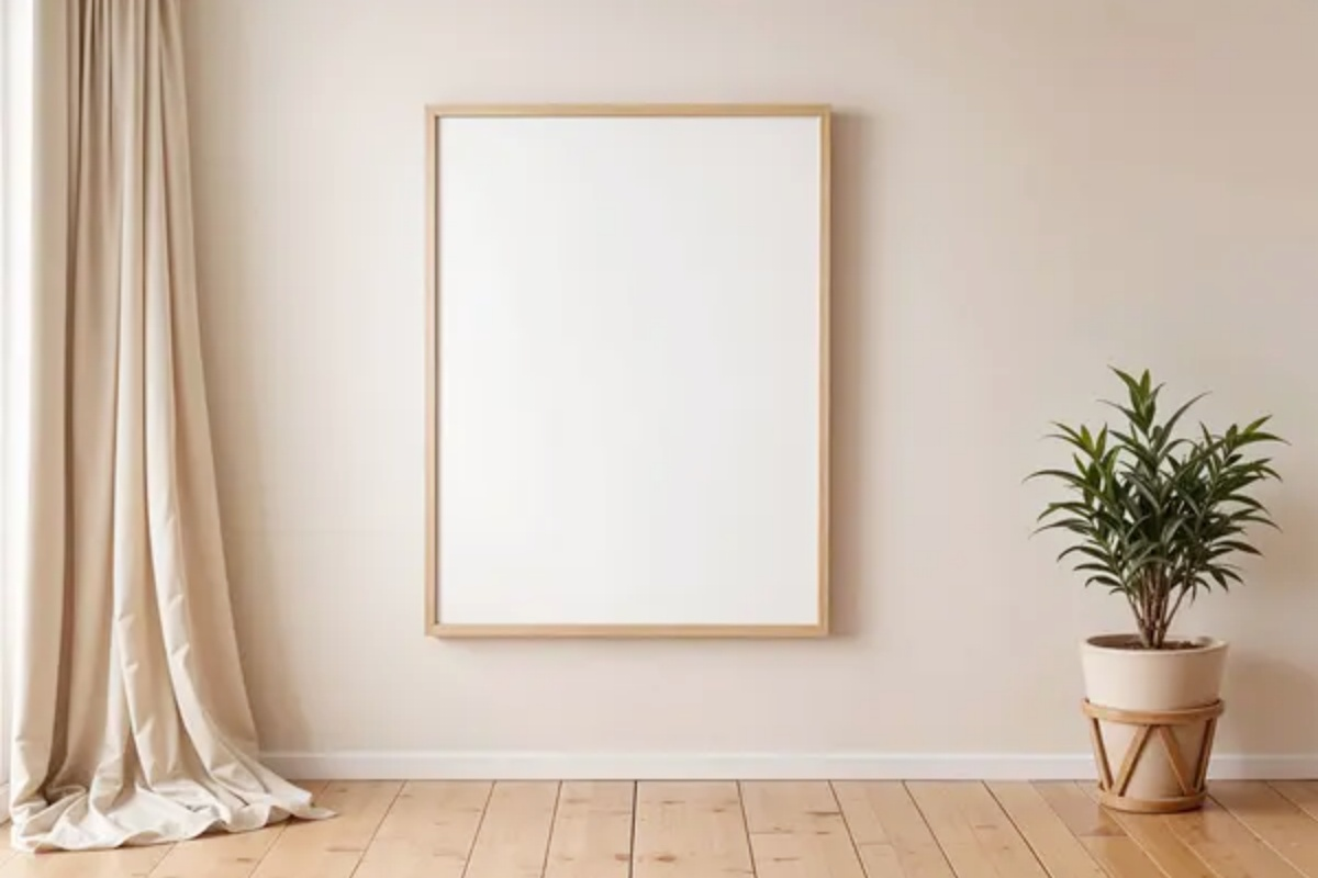
To be honest, it’s not just me—many people find themselves stuck in a strange phase after finishing their home renovations: the furniture is all in place, the lights are installed, and the floors are spotless, yet you still feel like something is missing. I used to be exactly like that. The sofa is neatly arranged, the TV wall is all set up, but when you sit down, it still feels empty and a bit cold—like a model home. It wasn’t until later that I realized the problem wasn’t complicated at all: the walls were just too bare.
But what came next was the real headache—I started looking for art, and then I was completely stumped. Landscapes, abstracts, minimalist pieces, vintage styles—they all looked nice enough, but the moment I imagined them actually hanging on my own walls, I lost my bearings. After buying several pieces that looked great online but looked terrible once hung, I finally started to figure things out.
If you’re stuck at this stage too, this article should help you avoid a lot of unnecessary detours.
Why Do Your Decorative Artworks Always Feel “Off”?
Let me start with a very common scenario: many people choose decorative art based purely on first impressions. They scroll through their phones, see a pretty image, place an order, and then hang it on the wall… only to realize it clashes completely with the rest of the room. It’s not that the artwork itself is bad—it’s just that it doesn’t mesh with your space.
I’ve made this mistake myself several times, but after reflecting on it, I realized the issues usually boil down to a few key factors. Sometimes it’s a clash of styles. For example, if your home has a warm, rustic vibe, but you hang a particularly cold abstract painting—it just looks jarring. Sometimes it’s the wrong size. A small painting on a big wall? Haha, it looks like a patch and makes the space feel cramped. A large painting crammed into a small space, on the other hand, can feel suffocating. Another very common issue—and I’m guilty of this all the time—is clashing colors. The room’s color scheme might be perfectly unified, but one painting can completely ruin the whole atmosphere.
Ultimately, none of this means your taste is lacking; it just means you’re missing a logical framework for making decisions.
When choosing decorative art, it really comes down to three things
After falling into so many pitfalls, I’ve gradually realized that choosing art isn’t actually that complicated.
I believe that if you can just clarify these three points, you’ll already be ahead of most people. First, consider the overall vibe of your home—the very intuitive one. Does your home lean toward warm tones or cool tones? Does it have a relaxed, casual feel, or a refined, understated one? Then, think about the purpose of the wall in question. Is it the focal wall in the center of the living room, the wall behind the bed in the bedroom, or just an inconspicuous little corner at the end of the hallway? Different locations can make a huge difference in how a painting feels. There’s one more thing that’s particularly easy to overlook—what do you want people to see first when they walk in? Many people haven’t even thought about this, but it’s really crucial. At its core, a decorative painting is meant to anchor the eye. Do you want it to immediately catch people’s attention the moment they look up, or do you just want to fill an empty wall and make the space feel more complete?
Once you have a clear answer to these questions, you’ll basically stop buying things haphazardly and avoid wasting money, right?
Different spaces really call for different approaches
At first, I thought that when choosing artwork, it was best to stick to a unified style throughout the entire home. But later I realized that the logic behind decorating different areas varies quite a bit. The living room is arguably the space where you want to make the biggest impression. If you have a feature wall behind the sofa, that wall essentially becomes the visual centerpiece of your home! The artwork doesn’t have to be complicated, but it needs to make a statement. I later swapped out a tiny single painting for a multi-panel piece. As soon as I increased the scale, the entire living room felt instantly grounded—the difference was striking. It used to feel empty and sparse, but now it’s as if something has stepped in to “anchor” the space.
The bedroom is a completely different story. My biggest mistake in the bedroom was hanging a painting with really jarring colors. Every time I lay in bed, it felt chaotic and unsettling—I really regretted choosing that piece for a while. Later, I swapped it out for a much softer, low-saturation piece, and the whole room finally felt calm. At the end of the day, the bedroom is your emotional sanctuary. The art doesn’t need to be eye-catching, but it should be pleasing to look at and help you relax.
As for spaces like the dining room or hallway, you don’t really need to be so formal. I later hung a pretty fun little painting in my dining room, and it actually became a little highlight that friends always take a second look at whenever they visit—and you know what? It’s actually quite fun.
Size and proportion are way more important than you think
Size and proportion are where I’ve stumbled the most. A lot of people—myself included in the past—just look at pictures when picking out art, rarely thinking about how it’ll actually look on the wall. If the size is off, even the most beautiful painting won’t work. Later, I learned a simple rule: for a sofa feature wall, a painting that’s about two-thirds the width of the sofa looks just right; for a single piece, it’s better to go slightly larger than too small. Another small detail: leave some “breathing room” between the painting and the furniture—if it’s too close, it’ll look cramped. These might sound like minor details, but they make a huge difference.
When it comes to color, it doesn’t have to be complicated
Regarding color, there’s actually a simple rule: find a corresponding color in your home that matches a color in the artwork. For example, if you have an orange throw pillow, having a touch of orange in the painting makes it look much more natural. If your space leans toward beige or wood tones, avoid suddenly introducing a splash of cool blue. Lately, when I choose artwork, I take a photo of my home and compare it while selecting—I rarely make a mistake this way. You should really give it a try!
My honest thoughts
Artwork comes in all price ranges, from cheap to expensive. I’ve tried the cheap stuff—it looks okay from a distance, but up close, the poor quality shows, and I wanted to replace it pretty quickly.
Later I started looking for brands with more thoughtful design—like Huemaster. They do handpainted oil paintings, and the canvas goes through a careful handcoating and sanding process. Depending on the subject, the artist will choose either a coarse or fine linen texture. Coarse texture works better for landscapes—it really brings out the feel of dirt and tree bark. Fine texture is better for delicate portraits. That kind of targeted material choice is something only custom handpainted work can offer—it makes sure the painting starts working for your image right from the base layer.
I later switched to one of their softer series for the bedroom, which has made the atmosphere much more comfortable; I feel a sense of calm every day.
Final Thoughts
If you’re ready to pick out some art, I get your dilemma. It’s not a necessity like a sofa, but choosing the right pieces can really transform your home.
My advice is: don’t rush to place an order. Take your time to look around and compare options, and think carefully about the vibe you want for your home.